

What's better than showing some love to your neighbors?
Welcome kit concept focused on making connections and building strong relationships with fellow franchisees in the area. Final boxes would be printed and shipped nationwide to over 5,000 Dutch Bros locations.
Initial idea crafted from the trendy, striking Dutch Bros branding guidelines, which included a primary color palette, exciting backdrops, and on-brand illustrations. Using those brand pieces, plus internal copywriting, this concept was built out as a 7"x7" square box – just large enough to hold a small coffee cup (and a few of their famous stickers, of course.)

Round One Concept

Round Two: more focused around message of 'building relationships', paired down color palette, fewer vector graphics.
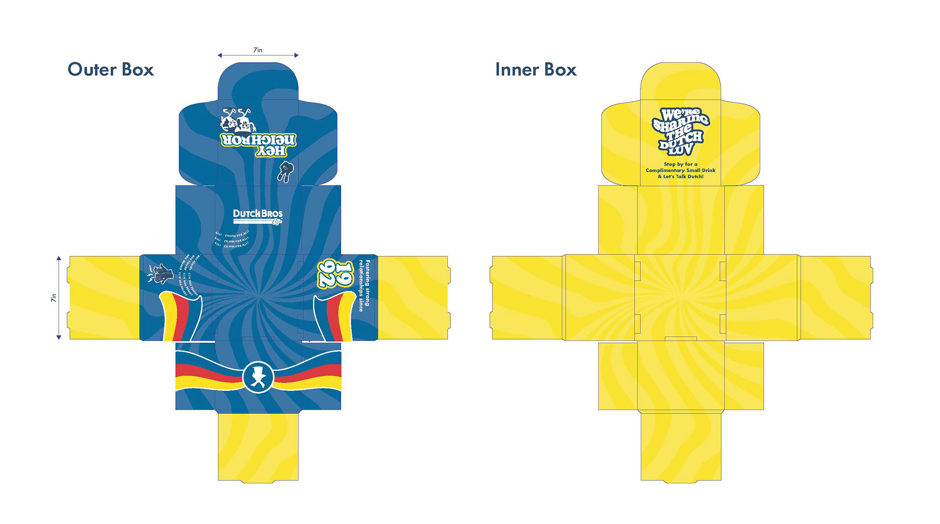
Round Three: dielines reworked to a standard size, additional tweaks to copy.

Top Panel
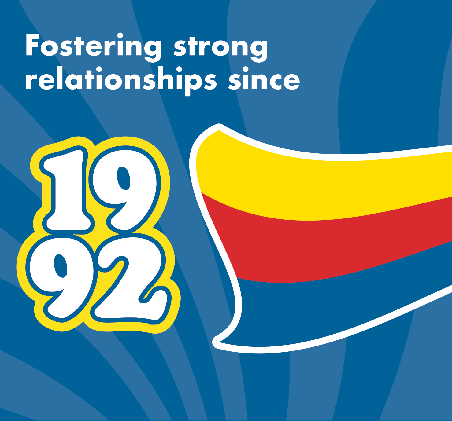
Left-Side Panel
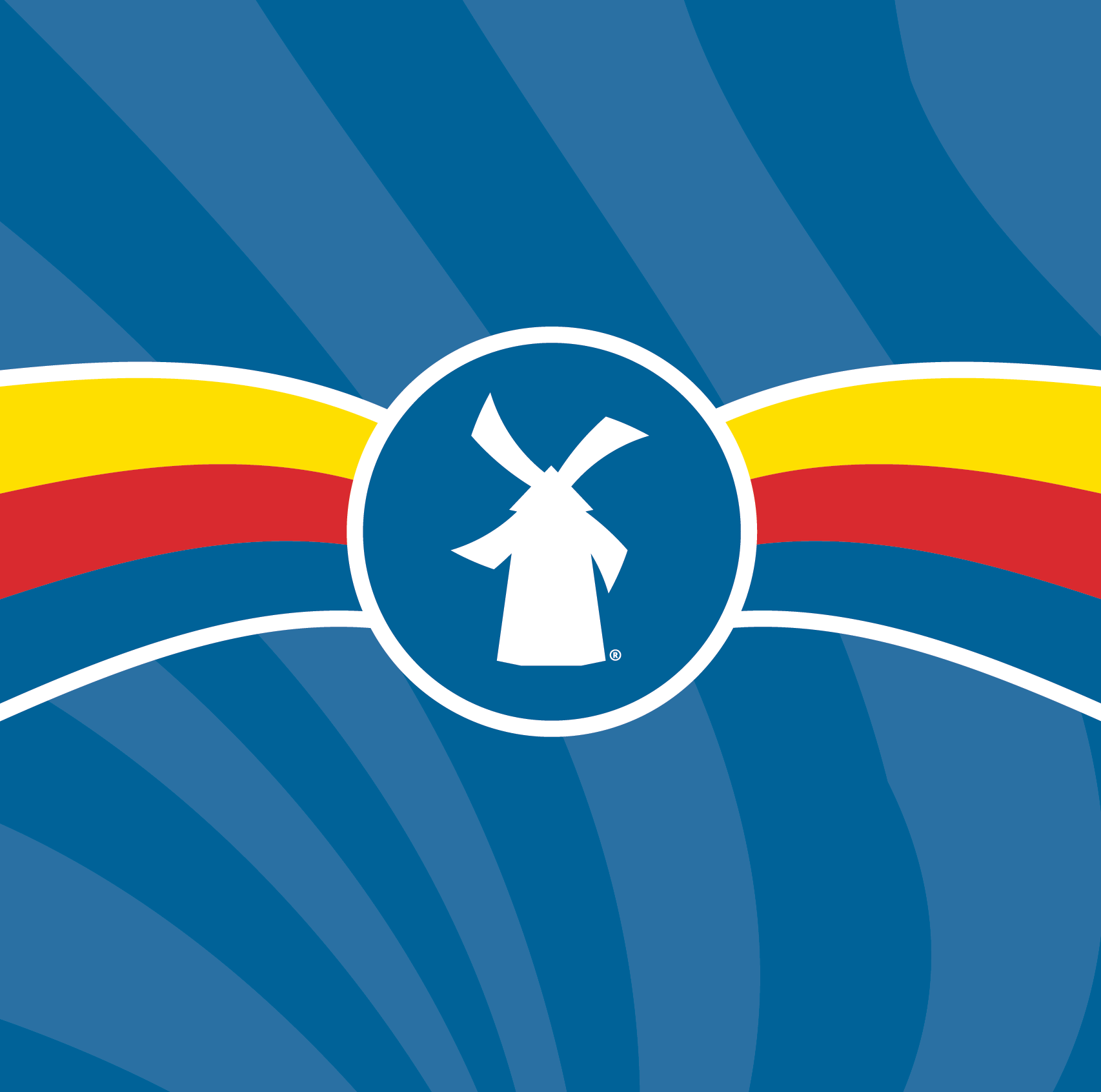
Front Panel

Right-Side Panel

Inside-Cover Panel
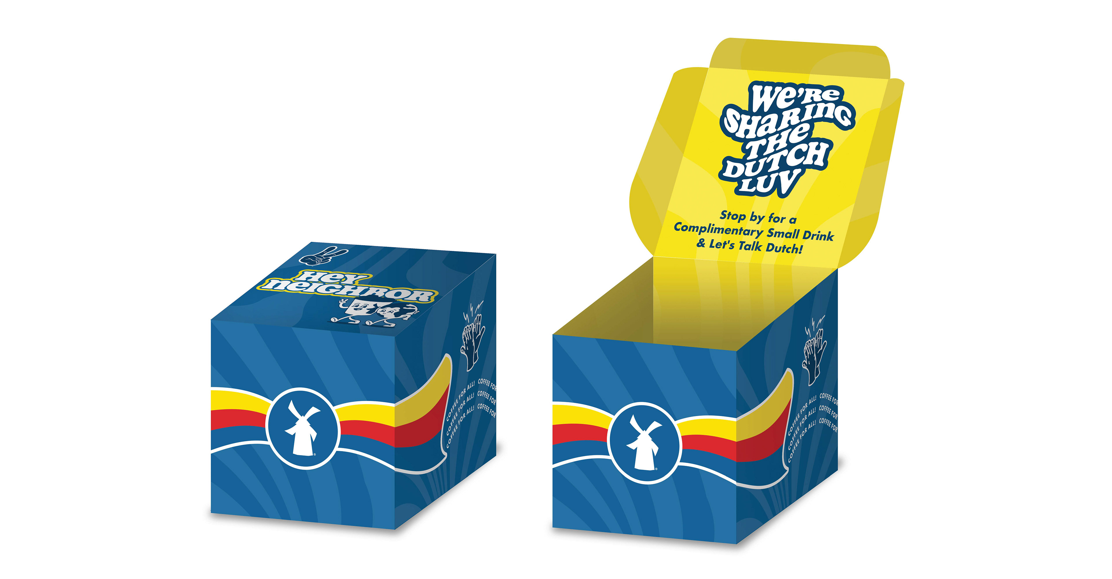
3D mockup of Round 3 concept.